You’re at the doctor’s for a scheduled appointment. It’s heaving. Even more than usual. Apparently, the temporary secretary doesn’t know how to manage bookings and she books too many people at once. So what do you do? You take photos at the surgery of course!
Having decided to use TLR cameras, I realised that I needed to get used to the format: 80mm (44mm in 35) and 6×6. It’s not a focal length I like. I shoot between 16mm and 28mm (in 35) mainly. I see the world in wide angle. 50mm is uncomfortable. 80mm gimme the heaves. 120mm makes me want to go home and cry.
But needs must, I need to rewire my brain to see a lot less of the world at once. So I switched my cameras to square format, set them at 45-50mm, and I try to shoot from the hip (if the camera has a folding screen).
One of the first difficulties was that I only had my phone. So I set it to x2 zoom, which gives me roughly 50mm focal length. Then the issue with that focal length is that the phone can’t focus very closely. So close ups are out. Anyway, I set it to B&W, and start taking photos. No edit, these are straight out of the camera.
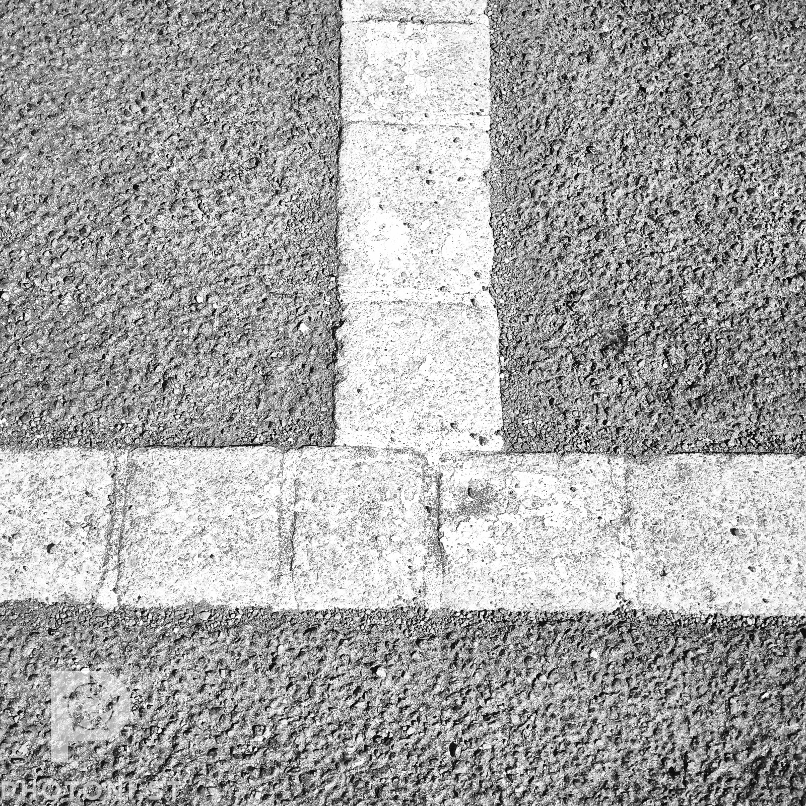
One of the differences with square format is that the emphasis in the rules of composition is slightly different: the rule of thirds is less important, rather central vertical and horizontal symmetries are privileged; central subjects are more common than third intersections subjects.
I tried to get a bit of both worlds in this one: a bit of vertical central symmetry and a bit of rule of thirds. I liked the balanced imbalance.
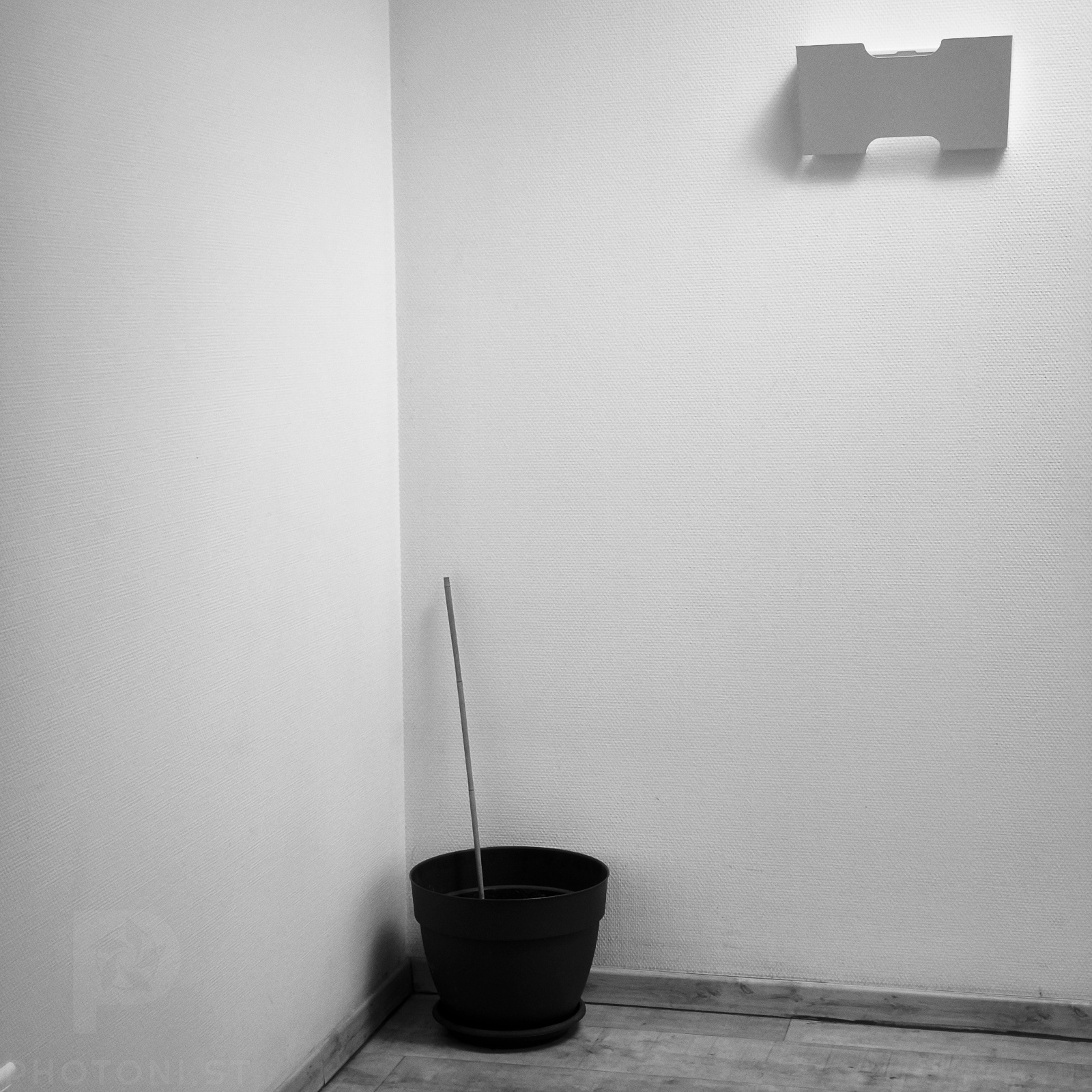
I also tried to marry symmetry and rule of thirds in this one. I was rather limited in what I could do because of the focal length and the space in the corridor. But it came out nearly as I had imagined it. If I had been able to, I would have put the bucked on a third intersection in the bottom left corner. But I would have had to zoom out, which would have been cheating.
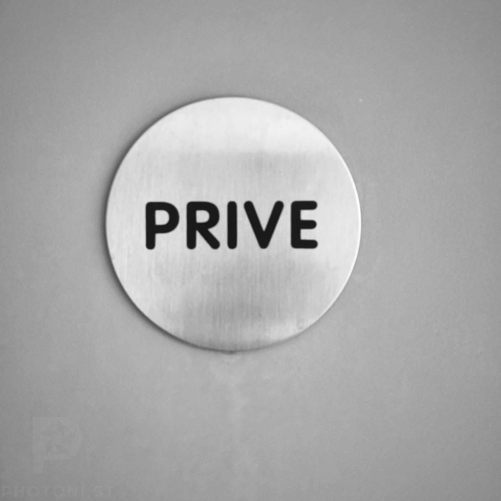
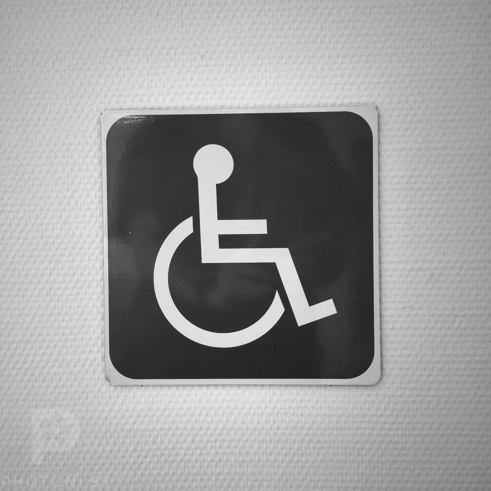
It’s easy to take lots of square signs, I know. I’m starting, so let me have that. The square is slightly askew because I was trying to avoid a reflection from the window. No edit means no fixing the perspective.
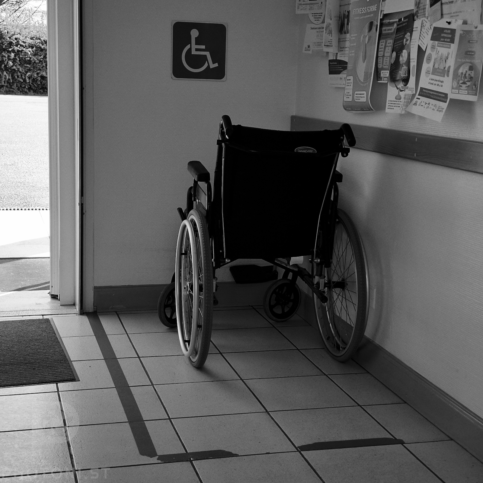
What amused me in this scene is how the wheelchair is within a blue rectangle as if it was in a cage (obviously you can’t tell it’s blue, but believe me it was). As if handicapped people needed to be segregated from the rest of the population. It’s nonsense of course, it’s probably there just to reserve the space near the door.
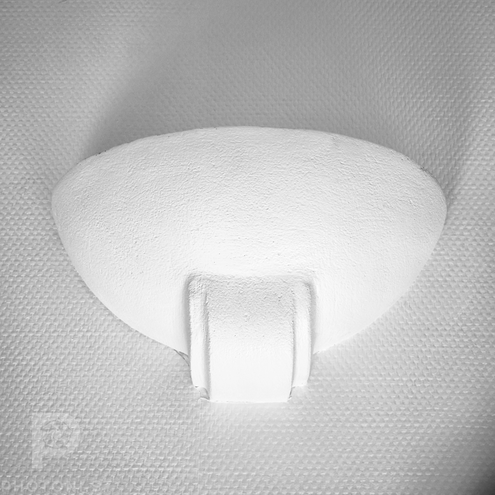
The square format is good for being forgiving of central compositions you’d call boring in 3:2 or other ratios. I liked the textures around that upward light. So I put it right in the center to get a vertical symmetry. It’s not quite perfect though because of the sideways lighting in that area.
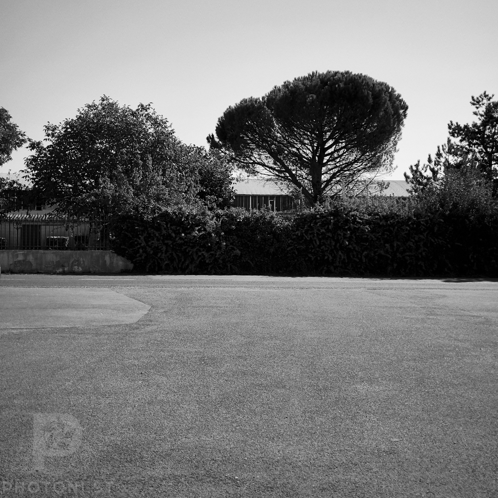
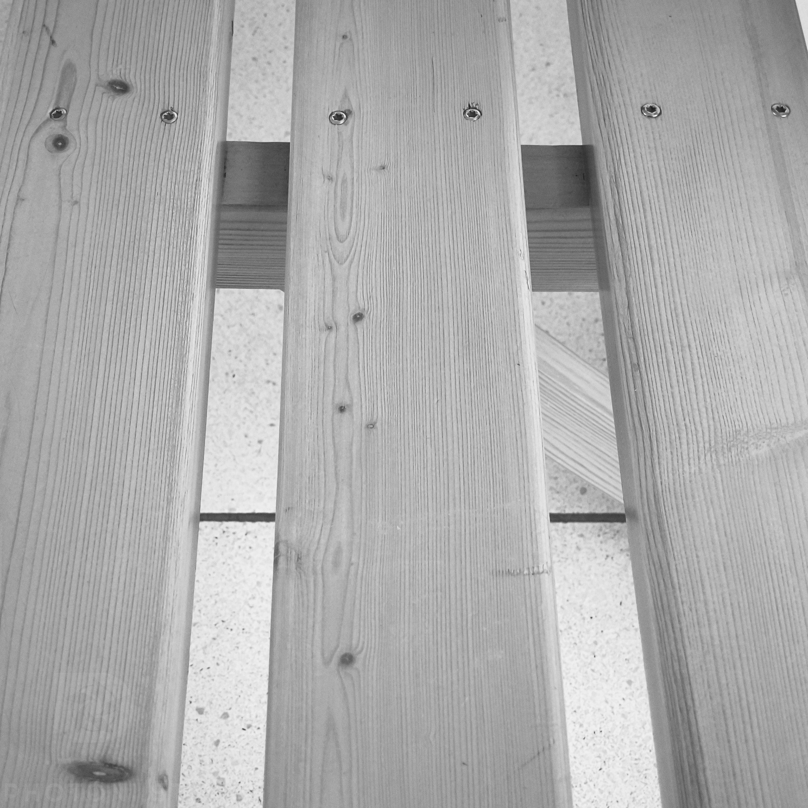
One of the difficulties I found with the square format is to give a sense of depth. Perspective is harder to capture when there is no length. So I tried with parallel pieces of wood (it was a bench).
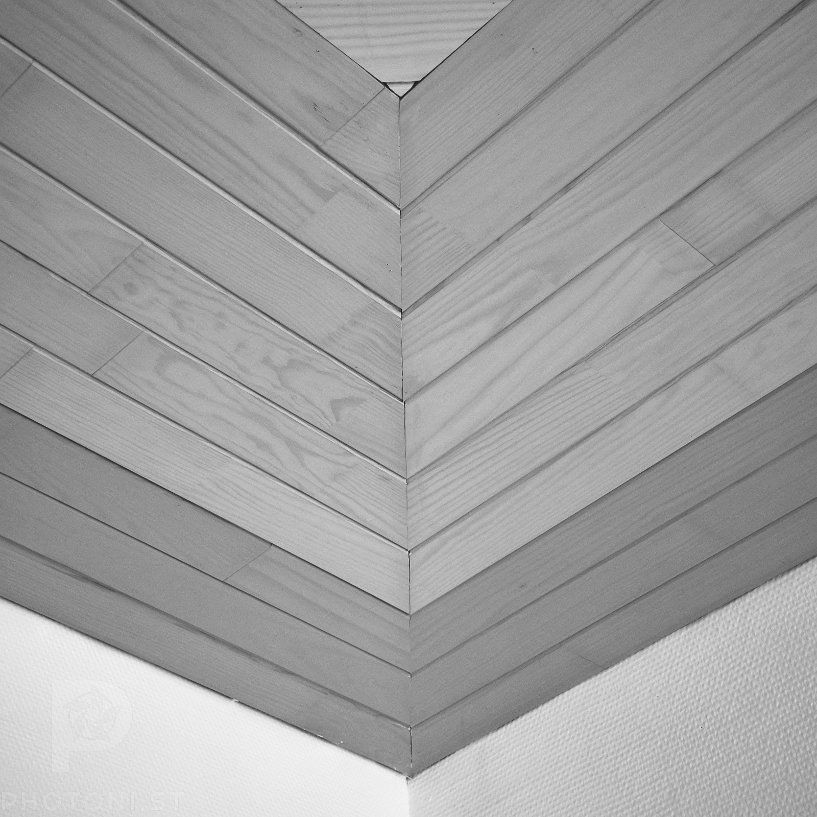
What works well in square format is geometrical patterns. The ceiling in the building have wooden patterns that lend themselves really well to a square frame. I could have taken loads of variations on this one, but only took this shot (I’m pretending I’m using film).
Overall it was an enjoyable experience that passed the time. I need more practice to internalise all the quirks of the square format, but I’ll get there eventually.
#Photography #NoEdit #PhotosExplained #Analysis #Square
One Reply to “Waiting in square mode”