
To start the series, I’ve taken a random photo from many years ago. In May 2009, I visited the isle of Islay, on the West coast of Scotland, with my wife and my parents. Islay is a pilgrimage place for people interested in peaty whisky and both my wife and my father are into it. So it made sense to have a visit.
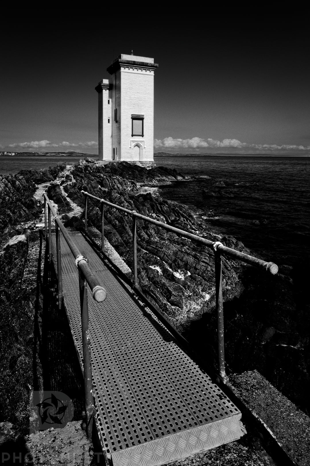
When I arrived at the location, the first thing that attracted my eye was obviously the lighthouse. With its bright white in front of the blue sky, it really stood out. So, I decided to take the photo.
I like lighthouses. The fact that they used to be manned, that they’re there to save lives, but require dedication and isolation of the lightkeeper make them poetic landmarks.
To make the photo, I needed to build it in a way that would sustain observation and prove interesting, even though the future viewer would not necessarily have the context or the history of my journey.
As often, I took a portrait oriented landscape. That’s just the way I read photos: from the bottom/foreground, up through the image, to the top/background.
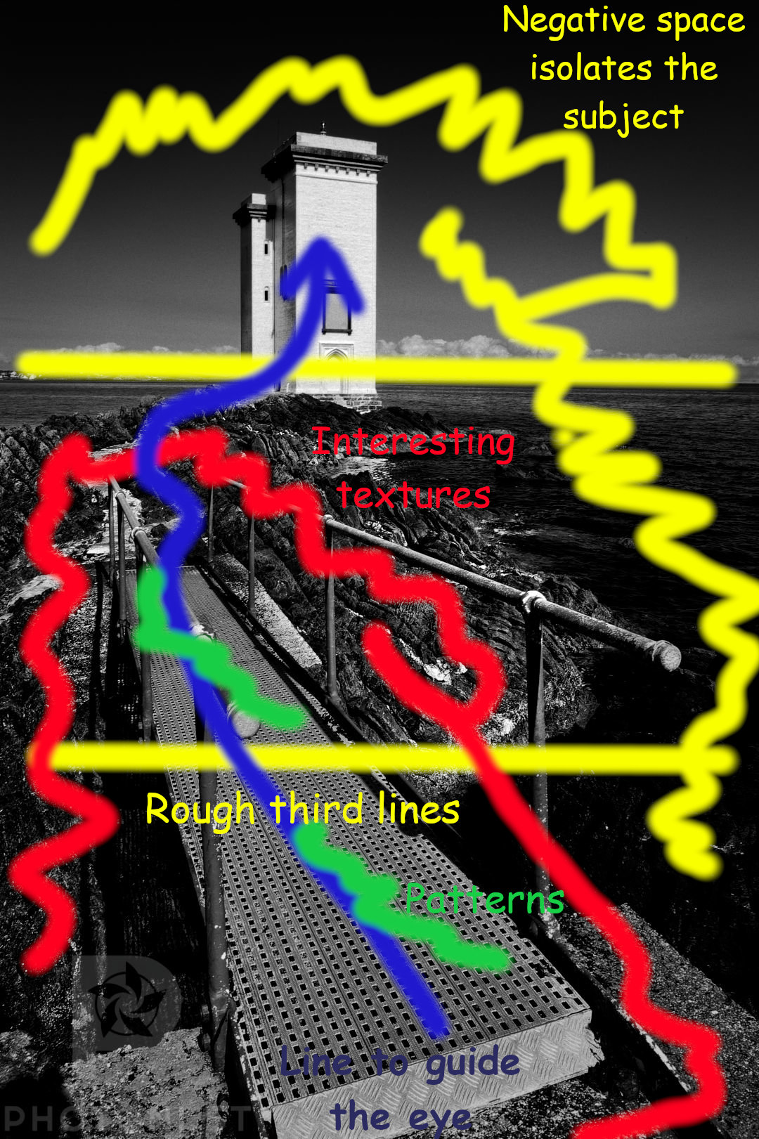
I didn’t want a lot of empty or repetitive space in the foreground, because that would make a boring image. So, walking around, I decided to include the metal bridge in the shot. I think I used the Canon 24-105ISL on the Canon 5D for this image. So the field of view wasn’t super wide, but just about wide enough to include the bridge without having to walk back and falling into the water.
By including the bridge, I was creating foreground interest, but also a lead into the photo. I needed to extend that lead all the way to the main subject: the lighthouse. So I looked for an angle that would also capture the white path that started after the bridge and went to the lighthouse. The bridge and the path form a line to guide the eye (in blue).
But I also wanted to put the accent on the lighthouse by separating it from the rest. So once I had my rough angle with the bridge and the path, I moved up and down to try to get the lighthouse above the top third of the image on its own. I didn’t have a clear separation between the bottom two thirds, but it wasn’t too important.
Doing that also allowed my to include negative space to frame the lighthouse and not distract the eye from it once the viewer got there through the photo (in yellow). That way, it was obvious to the eye what was really important in the shot: the bridge, the rocks, and the lighthouse. The rest is empty space.
Finally, the composition is nearly triangular from the base to the lighthouse. Triangles are important in composition because they are pleasing shapes and act as a guide.
As an added bonus, the rocks created interesting textures that the viewer can visit after the first journey through the image as a secondary exploration (in red).
In terms of processing, I converted to black and white and increased the contrast to make the blue sky and the sea nearly black (without blowing the clouds). That way, their colour increase the framing of the main subject.
I added grain because I like grain in my monochrome images, and increased slightly the sharpness of the rocks and the metal of the bridge to make them pop a bit more and sustain observation.
I don’t think I thought of anything else when I was composing.
#Photography #PhotoAnalysis #PhotosExplained