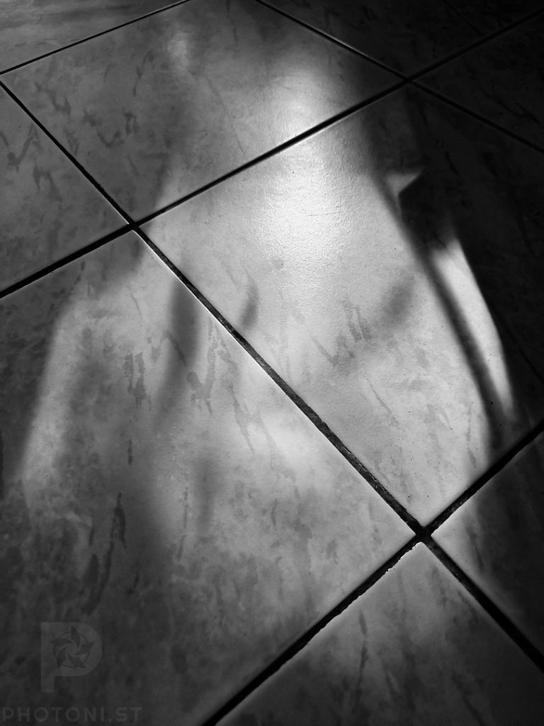
Taken in the town near Paris where my parents live. I couldn’t resist the repetition of the heads.

Personal photography
Taken in the town near Paris where my parents live. I couldn’t resist the repetition of the heads.
For me, photography is a deeply solitary process. It’s not something I do in the company of others, nor in groups, and I don’t really talk about it with anyone directly. In an era of social media and oversharing, where every moment seems to be documented for likes and comments, this may seem counterintuitive. But for me, the act of taking photos is about introspection. It’s a personal experience. One that doesn’t require, and is often hindered by, external input.
As I shoot mostly square at the moment, I look for symmetry. the square format lends itself to highlighting symmetry because of the symmetry of the frame.
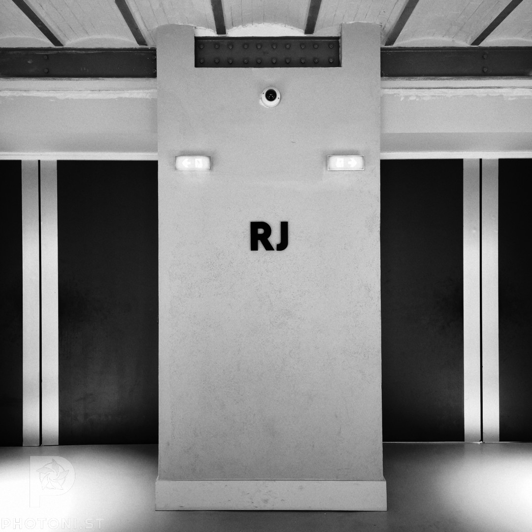
When I was at Paris Photo, I saw that spot and the symmetry of everything struck me. Everything was so perfectly as it should be. Except the RJ which I put in the middle to accentuate that it’s different from the rest.
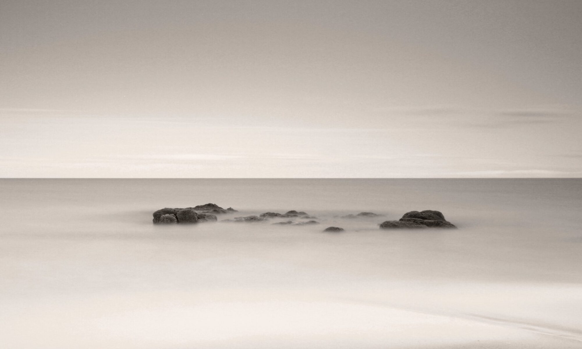
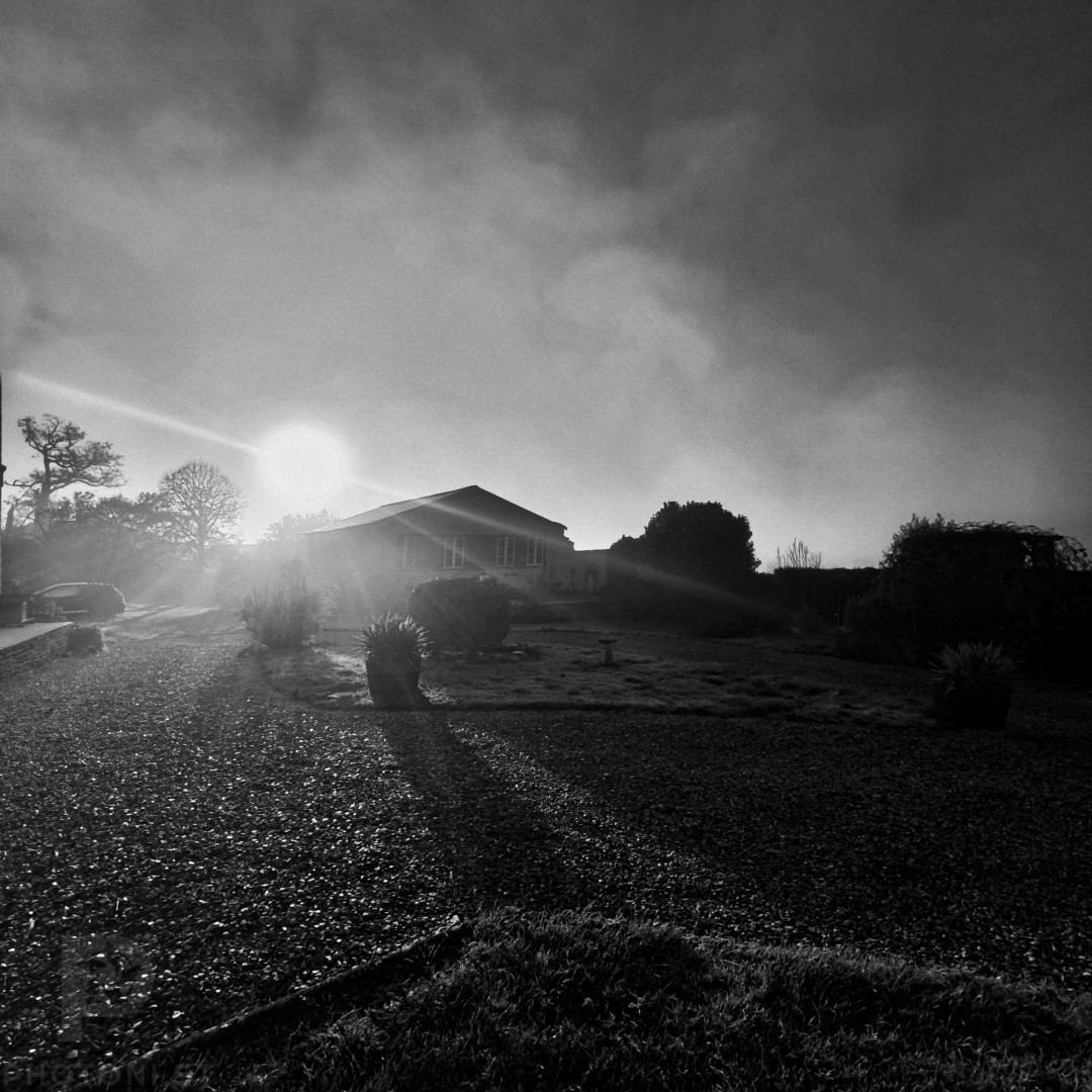
Fog and sun make an interesting mix. This is also a mix of technique for me: landscape photo, but in square and monochrome. Mixing it up all round this morning.
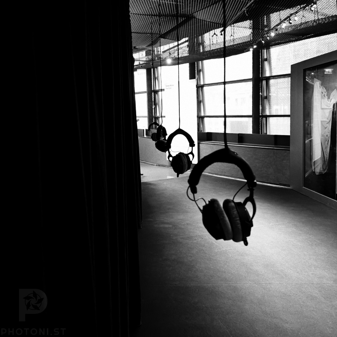
I took this photo at an exhibition in the Quai Branly museum in Paris.
The line of headphones is what attracted me when I was walking from piece to piece in the exhibition (Hoda Afshar). They have nothing to do with the exhibition itself, they’re probably there in general, but when I saw them I knew I wanted to photograph them somehow.
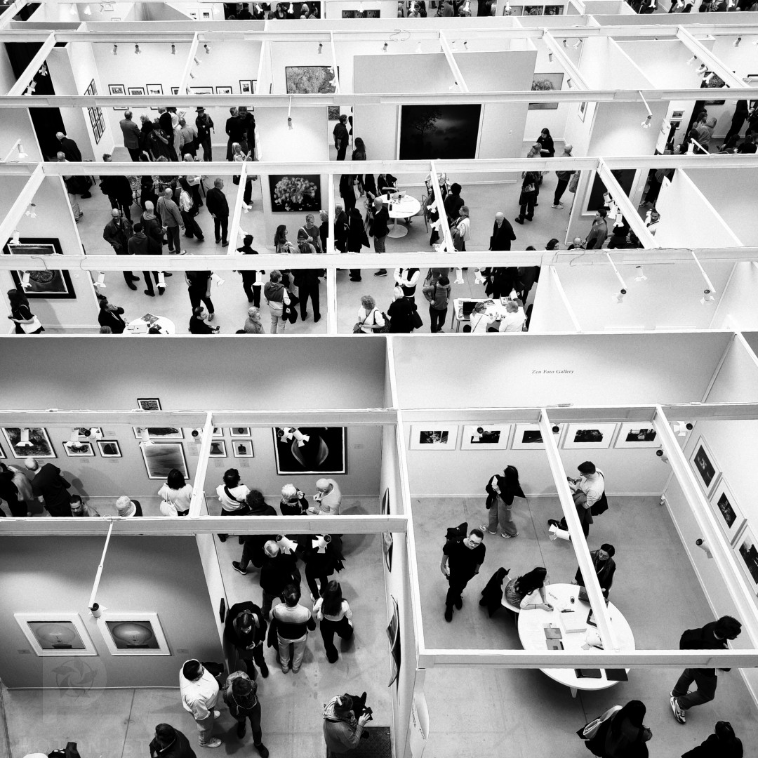
View from above at Paris Photo. It reminded me of a rat labyrinth so I couldn’t resist.
Since I started taking photography seriously ca. 2003, the craft has become democratised beyond recognition. Every pocket contains a device capable of producing images that would have required thousands of euros of equipment twenty five years ago. But, I see the same tired shots repeated endlessly: the obligatory sunset, the artfully arranged breakfast, the mirror selfie with calculated spontaneity, the same copycat shots of the masters.
This saturation creates an interesting paradox: we’re drowning in images whilst starving for actual photography. Are we really all photographers?
It’s been unusually warm in Paris for November. People take the sun really morning in the Tuileries park.
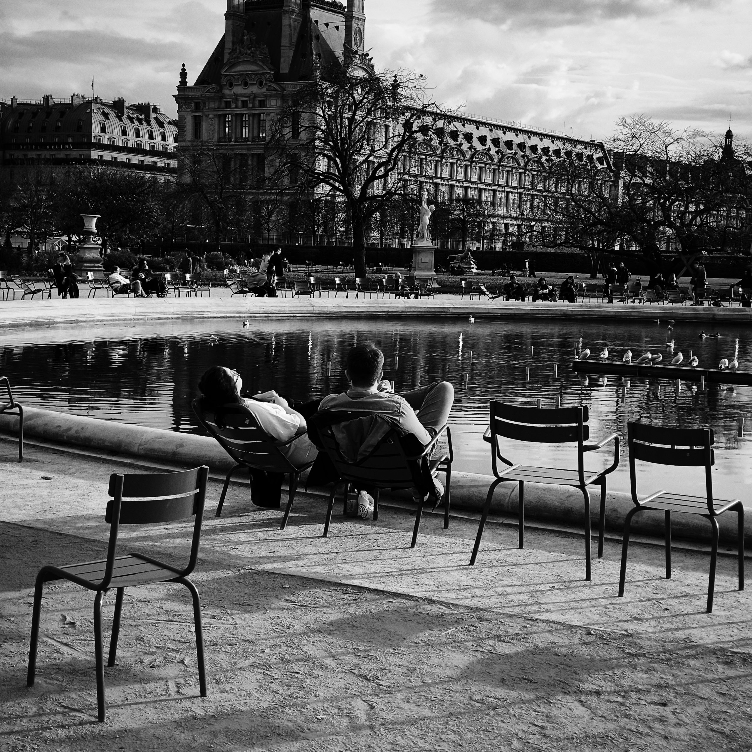
#Photography #BlackAndWhite #BlackAndWhitePhotography #Paris #Street
Your habitual locations tend to feel boring, empty of photographic interest. Ordinary is a curse. But are they, really? Is it really what the problem is?
In photography, there’s a fascinating paradox: while equipment isn’t the essence of photography, it can serve as a powerful catalyst for creativity.