
I think I will make this newsletter a Monday one. With I May Be Wrong on Friday.
Most of the time, I take my landscape photos in portrait orientation. That’s just the way I read photos. And I rarely crop because I learned to get what I want in camera.
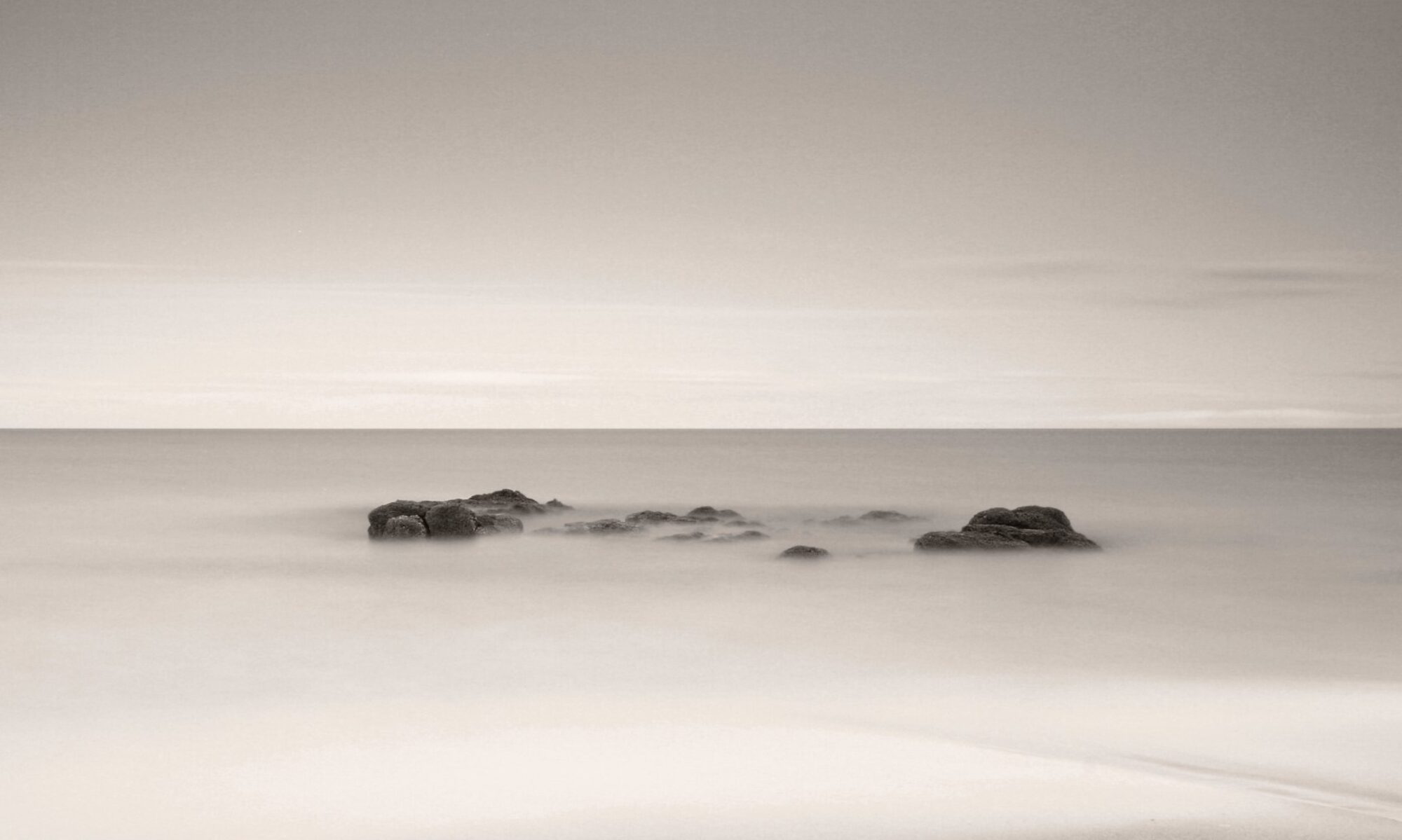
But sometimes, you see a scene where you want to emphasise the quietness. You’re looking at something that just relaxes you, where everything is still, silent, a breath of fresh air. For those occasions, there isn’t much that is more effective than a square composition.
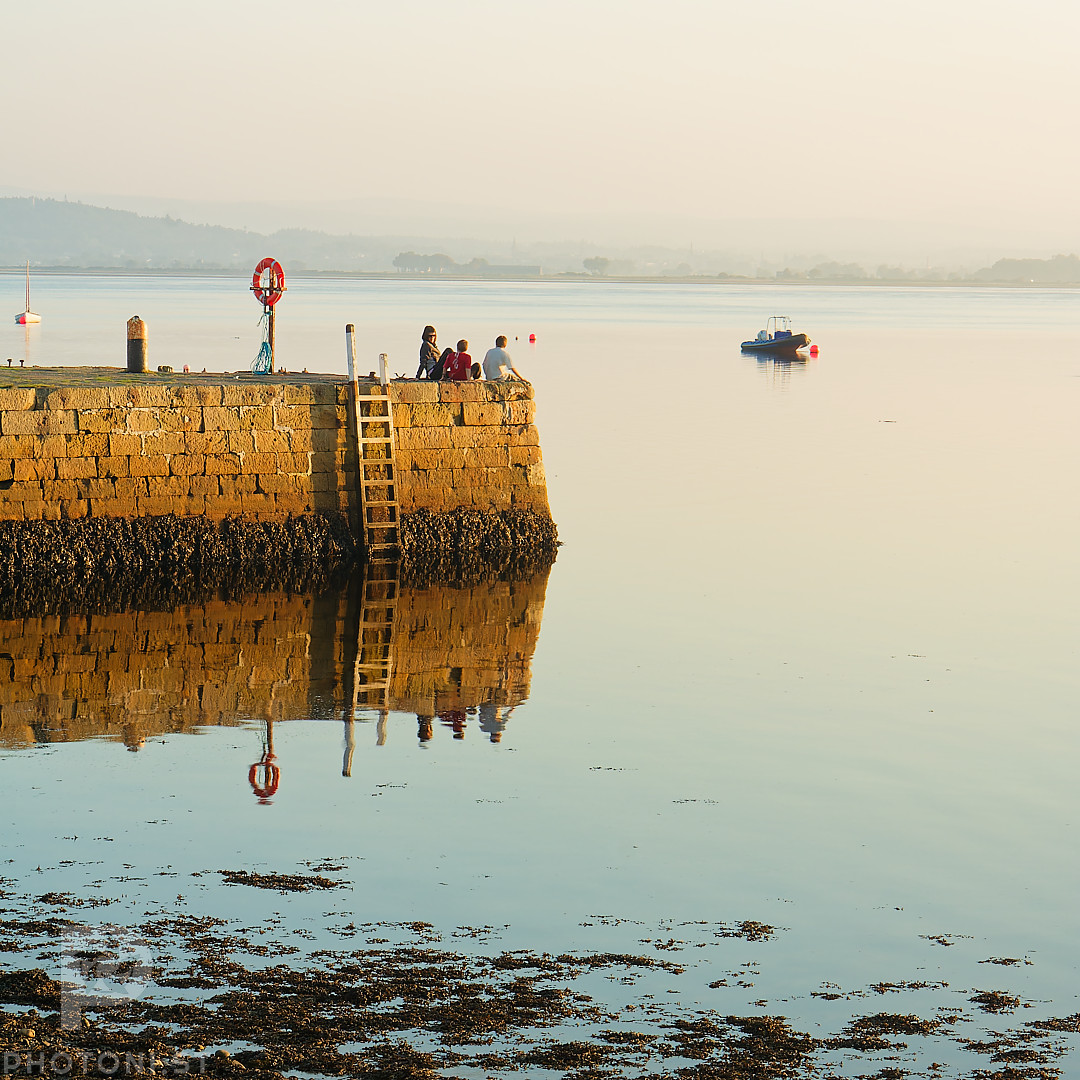
The photo was taken on the 15th October 2006 in Findhorn, Northern Scotland, with a Canon 350D + Canon 17-55IS lens. At that time of the year, the days are getting a lot shorter, the air becomes a bit fresh in the evening, but on the rare sunny days the temperature is still comfortable and the light is amazing when the sun sets.
My subject was the group of people chatting and watching the sea at sunset. They were relaxing and clearly enjoying their time. I wanted to capture that.
So my first decision was to go square. I knew from experience that if a shot has a strong symmetry, the square format accentuates it and makes the shot very static, very calm. It doesn’t work for every kind of scene and can feel boring, but that was exactly what I was after.
Then I decided to I make sure that the pier was centered. That would be the symmetry enforcer in the photo. Because it’s in the middle, so massive compared to everything else, and the only thing that really has colour, it forces the brain to consider it the anchor of the scene. And as it is connected to the left side of the frame, the photo is read from left to right in the centre: you start on the left edge, follow the pier, and end up on the subjects.
The negative space, right of the pier, has two functions: it stops the eye on the subjects once you went down the pier, and it gives the subjects space to breathe. There isn’t much I dislike more than people too close to the edge of the photo toward which they look. People should have space to look or move to. And in this case, it shows the viewer what they were watching.
The fact that the sky and the sea were nearly the same colour (I had a 2 stop ND grad on the sky because it was still quite bright) unifies both and extends the negative space around the subjects.
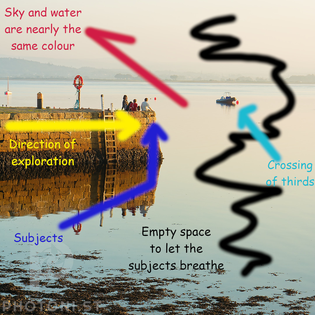
There was a boat in the sea that I could have removed in post. But I decided to put it on the crossing of the thirds as a point of interest in the empty space instead. It might or might not work for the viewer. For me it works. It embodies what the subjects were looking at in the distance.
The algae at the bottom isn’t ideal, but I couldn’t avoid it, unless I cropped more but then the subjects would be trapped. It kind of balances the shoreline in the background, anyway.
I only had time to take one shot, after that the people got up and walked away.
#Photography #PhotosExplained #Analysis